Overview
Demographic and economic factors are important determinants of government expenditure. They are also the chief determinants of growth in real GDP per person which, in turn, determines the government’s ability to finance expenditure.
Demographic change is projected to have major effects on the future size and composition of the Australian population. The composition of the population will change considerably as a result of a decline in fertility rates which commenced in the 1960s. This, and increasing life expectancy, will lead to a marked ageing of the population, although a continuation of significant levels of net migration will reduce the rate of ageing to some extent.
Productivity improvements have driven growth in real GDP per person over the past 40years, and are projected to continue to be the main source of this growth over the next 40 years.
Other factors have made a small positive contribution to growth in real GDP per person over the past 40 years, but are projected to subtract from growth in the future. Ageing of the population is projected to slow the rate of growth in real GDP per person by reducing the proportion of the population of traditional working age (15–64 years) and therefore the rate of labour force participation across the whole population.
Reflecting recent trends, projections of fertility rates, life expectancies, age-specific participation rates and levels of migration are all higher in IGR2 than in IGR1. As a result of higher fertility rates, life expectancies and net migration, the population is projected to be larger over the next 40 years than in IGR1. The current level of nominal GDP per person is significantly higher than was projected in IGR1, due to the recent strong rise in the terms of trade, higher labour force participation and higher levels of skilled migration. This higher level is projected to be sustained over the next 40 years, with favourable implications for the fiscal gaps projected in this report.
Framework for analysing real economic growth — 3Ps
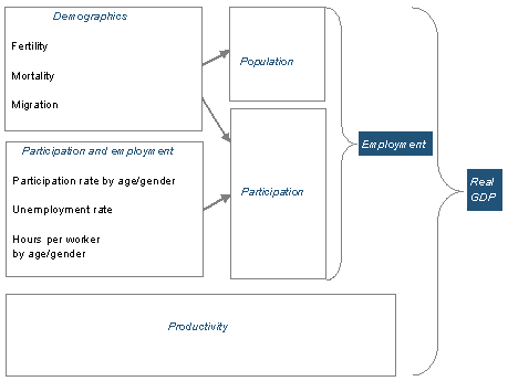
In analysing the projections in this report, real economic output (real GDP) is disaggregated into three components: population, participation and productivity (the 3Ps) (Chart 2.1). In this decomposition, population is the number of people of working age (15and over); participation is the average number of hours worked in the labour force by each working-age person; and productivity is the average output produced per hour worked.
Projections for each of the 3Ps are, in turn, determined by a range of demographic and economic assumptions. The demographic assumptions are those for fertility, mortality and migration, which affect the number of people of working age (population) as well as the composition of the population by age and gender. Because employment and hours worked differ substantially across age-gender cohorts, changes in the composition of the population also significantly affect participation. Furthermore, changes in labour force participation or average hours worked by different age-gender cohorts affect aggregate participation, as do changes in the unemployment rate. Finally, in this decomposition, the assumed level of labour productivity (productivity) contributes directly to the level of real GDP.
There are also interactions among the 3Ps, for example, between participation and productivity. For example, at a time of low unemployment, increasing participation could draw less productive workers into employment and temporarily reduce overall average productivity growth.
Demographic and economic projections are inherently uncertain, especially over periods as long as 40 years. This report presents baseline projections for demographic and economic developments over this time, based on historical trends. Nevertheless, it is inevitable that currently unforeseen developments will, sooner or later, render these projections inaccurate. The sensitivity analysis in Appendix B provides results for reasonable alternative assumptions to the baseline projections presented in this report.
|
Chart 2.1: Population, participation, productivity and real GDP
|
Source: Treasury.
Population
Projections of the population depend on assumptions about fertility, mortality and migration. In common with other OECD countries, the Australian population will continue to age, driven by steadily declining mortality rates and below-replacement fertility rates. Net overseas migration into Australia will increase the population and reduce the rate of population ageing, as migrants are significantly younger on average than the resident population.
Several developments since IGR1 are projected to continue into the future and will have an impact on both the size and average age of the Australian population. Mortality rates have fallen more rapidly than anticipated in IGR1, tending to raise slightly the average age of the projected population. Higher-than-anticipated fertility rates and changes to Government policy encouraging greater numbers of skilled migrants — who are younger on average than the resident population — tend to lower slightly this average age. Taken together, these changes have led to a projection of a significantly larger and slightly younger population than in IGR1.
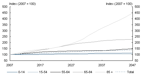
Between now and 2047, it is projected that the number of young (0-14 years) resident Australians will rise slightly, those of traditional working age (15-64 years) will rise by about one-fifth, older people (65-84 years) will more than double, and the very old (85 and over) will more than quadruple.
Fertility
The total fertility rate (TFR) of Australian women peaked at 3.5 births per woman in 1961 at the end of the post World War II baby boom. After that, Australia’s TFR declined rapidly during the 1960s and 1970s, stabilised during the 1980s and gradually declined over the 1990s. The TFR has broadly stabilised since around 1998, increasing slightly since 2001 (Chart 2.2).
Age-specific data show increasing numbers of women deferring child bearing until their late 20s or early 30s. This trend has been evident since the 1990s, and remains a key influence on Australia’s changing population structure. The increasing number of children born to women in their 30s is not compensating fully, however, for the declining number born to women in their 20s.
Australia’s current TFR of around 1.8 births per woman is higher than the fertility rates in many OECD countries, including Italy, Germany, Japan and Canada, and higher than the OECD average of 1.6. However, it is below those for New Zealand (1.95 in 2003) and the United States (2.04 in 2003). Based on recent age-specific fertility trends, Australia’s TFR is projected to increase initially, then to fall slowly to 1.7 by 2047 (Chart 2.2), higher than the TFR of 1.6 in 2042 which was projected in IGR1.
Chart 2.2: Australia’s historical and projected total fertility rate
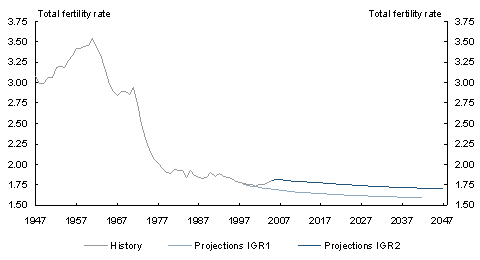
Note: The total fertility rate is the number of children a woman would bear during her lifetime if she experienced the current age-specific fertility rates at each age of her reproductive life.
Source: Australian Bureau of Statistics Cat. No. 3301.0 (various) and Treasury projections.
Mortality
Average Australian mortality rates have fallen strongly over the past cen
tury. As a consequence, life expectancies have risen for both men and women. Falling mortality rates add to population growth and imply a higher proportion of aged people in the population.
Australia’s crude death rate has fallen from 8.0 deaths per thousand in 1976 to its lowest recorded rate of around 6.4 deaths per thousand in 2005.
Mortality rates are falling across all age groups and this trend is projected to continue for at least the next four decades. Women have lower mortality rates than men and are projected to continue to live longer on average. Nevertheless, mortality rates for men are falling slightly faster than those for women, so that in older age groups, the proportion of men is projected to continue to rise slowly.
Australians’ life expectancies are now among the highest in the world. United Nations data indicate that Australia’s life expectancy at birth for both men and women is higher than in most other countries including Canada, New Zealand, the United Kingdom and the United States.1 For men only Iceland, Hong Kong, Japan and Switzerland have higher life expectancies at birth. For women only Japan, Hong Kong, Switzerland, Spain and France have higher life expectancies at birth.
Australians’ life expectancy at birth for men rose from 55.2 years in the period 1901-10 to 78.5 years in 2003-05, and for women, from 58.8 to 83.3 years in the same time spans. Over the past five years, life expectancies have risen more rapidly than expected in IGR1; a trend that is projected to continue. Men born in 2047 are now projected to live an average of 6.9 years longer than those born in 2007, and women an average of 6 years longer (Table 2.1).
Table 2.1: Australians’ projected life expectancy (in years)

Source: Treasury projections.
Also of importance to population ageing is the projected rise in life expectancy at older ages. Based on recent trends, men aged60 in 2047 are projected to live an average of 5.1years longer than those aged60 in 2007, and women an average of 4.7 years longer (Table2.1).
Migration
The level of net overseas migration is important: net inflows of migrants to Australia reduce the rate of population ageing because migrants are younger on average than the resident population. Currently, around 85 per cent of migrants are aged under 40 when they migrate to Australia, compared to around 55 per cent for the resident population (Chart2.3).2 Of course, migrants also age and add to the older-age resident population over time.
Chart 2.3: Age distribution of Australian population and migrants
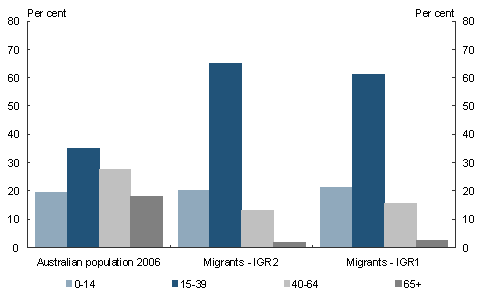
Source: Australian Bureau of Statistics data and Treasury projections.
The contribution of net overseas migration to population growth has varied significantly over the past four decades (Chart 2.4). Net migration tends to fall during economic downturns, both because governments respond by adjusting the migrant intake and because permanent and long-term departures increase at these times.
Chart 2.4: Net migration and natural increase in population
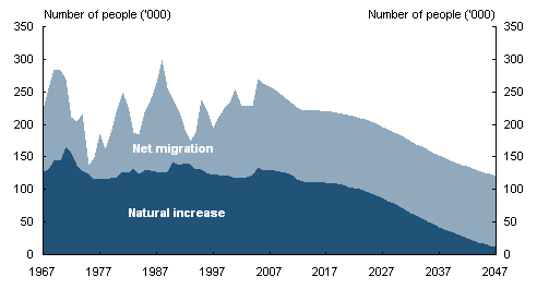
Source: Australian Bureau of Statistics Australian Historical Population Statistics Cat. No. 3105.0.65.001 and Treasury projections.
Consistent with the annual average over the past 10 years, future net overseas migration is projected to be constant at 110,000 people per year from the end of the forward estimates period, with the same age-gender profile as at present. In recent years, Government policy to increase the level of skilled migration has resulted in higher net migration and slightly younger migrants, on average, than anticipated earlier. (The IGR1 population projections were based on net overseas migration of 90,000 people per year.)
Population projections
Australia’s estimated resident population reached slightly over 20.6 million in June2006, and is projected to rise by 38 per cent to 28.5 million by June 2047. The annual growth rate of the population is projected to slow gradually, from 1.3 per cent in 2006-07 to 0.4percent in 2046-47. Natural increase (total births minus total deaths) is projected to remain positive until after 2046-47,3 with net overseas migration adding further to total population growth. The population in all age groups is projected to rise, although rates of growth differ among age groups, leading to different shares in the 2047 population than at present (Table2.2).
Table 2.2: Australian population history and projections
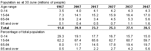
Source: Australian Bureau of Statistics Australian Historical Population Statistics Cat. No. 3105.0.65.001 and Treasury projections.
Chart 2.5: Proportion of the Australian population in different age groups
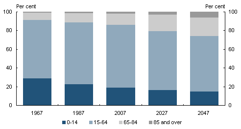
Source: Australian Bureau of Statistics Historic Australian Population Statistics 3105.0.65.001 Table 19 and Treasury projections.
The projected population for selected age ranges highlights the continuing growth in the proportion of older people. In June 2007, the proportion of those aged 65 and over is projected to reach 13.4per cent, rising from only 4per cent a century ago. By 2047, just over 25percent of Australia’s population is projected to be aged 65 and over (Table 2.2). The proportion of the very old (aged 85 and over) is projected to rise from 1.7 per cent in 2007 to 5.6percent in 2047 (Chart 2.5).
The population of traditional working age (15-64 years) is projected to grow by over 20percent by 2047, but to fall as a proportion of the total population by around 8percentage points from current high levels of around 67per cent. The fastest growing group of traditional working age people is that aged 55-64, rising by nearly 50 per cent over the next 40 years (Chart 2.6). The growing number of people in the 15-64 age group is projected to increase the size of the total labour force.
Chart 2.6: Population indices by age group
Source: Treasury projections.
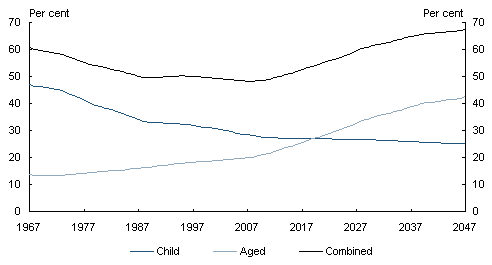
In 2007, the aged-to-working-age ratio (the proportion of people aged over 65 to people of traditional working age, 15-64) is almost 20 per cent. This is projected to rise to over 42per cent by 2047 (Chart 2.7). Over the same period, the child-to-working-age ratio (the proportion of people aged under 15 to those aged 15-64) is projected to fall by slightly over 3percentage points. In 2007 there are 5 people of working age to support every person aged 65 and over. By 2047, there will only be 2.4 people of working age supporting each person aged 65 and over.
Chart 2.7: Australia’s child- and aged-to-working-age ratios
Source: Australian Bureau of Statistics Cat. No. 3201.0 (various) and Treasury projections.
|
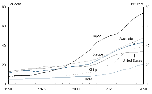
Box 2.1: Global demographic change Populations across the globe are ageing because of declining rates of both mortality and fertility, which in turn are driven by rising levels of development and improving health care. However, across countries the rates of change are diverse. These demographic trends are manifest in rising old-age dependency ratios, which are projected to at least double for Australia, Europe, India and Japan, but more than triple for China from now until 2050 (Chart 2.8). The US old-age dependency ratio is projected to rise but, with relatively favourable demographics, less than for other major countries and regions. Chart 2.8: Old-age dependency ratios Ratio of over 64-year-olds to 15-64-year-olds
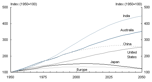
Source: Treasury projections and United Nations 2006 Revision Population Database, medium variant projections. Sizeable differences in population growth rates across the globe will reflect differences in both demographic trends and openness to migration. Largely due to higher projected rates of migration, population growth in Australia to 2050 is expected to be faster than in all the other countries and regions in Chart 2.9, except for India. Some countries and regions are expected to experience either declining or very slowly growing populations. The populations in Europe and Japan are projected to fall from now to 2050. China’s population is projected to rise by around 10 per cent over the next 25 years, then decline gradually. Chart 2.9: Projected population trends
Source: Treasury projections and United Nations 2006 Revision Population Database, medium variant projections. |
Participation
Participation in employment is determined by the proportion of people of working age in the labour force (the participation rate), the proportion of people in the labour force who are employed, and the average hours worked by those in employment. For the population as a whole, the participation rate and average hours worked, in turn, depend on the distribution of the population between different age and gender cohorts, and on the participation rates and average hours worked by people in each of these cohorts.
Participation rate
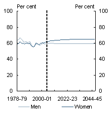
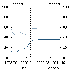
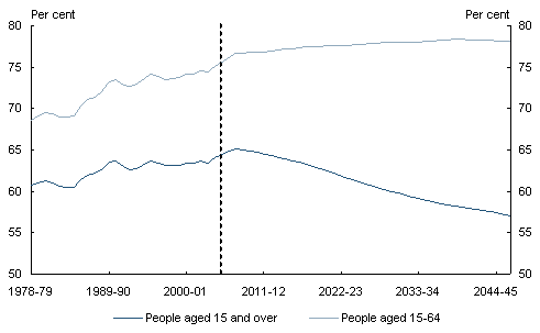
The total labour force participation rate for people aged 15 and over has risen gradually from 60.7 per cent in 1978-79 to 64.5 per cent in 2005-06 (Chart 2.10). This is due to a strong rise in women’s participation over that time, from 43.5 per cent to 57.2percent, partly offset by a fall in men’s participation, from 78.5 per cent to 72.1percent.
The projections of Australia’s long-term total participation rate are based on historical trends in participation rates for men and women of different ages. The labour force projections also incorporate the changing demographic structure of Australia’s population.
The composition of the labour force has changed considerably over the past two decades, with a greater proportion of women of all ages now participating in the workforce, a rise in part-time participation for both genders and higher participation rates for older workers than in the late 1970s.
The ageing of the population is projected to lead to falling total participation rates over the next 40 years. Notwithstanding significant recent rises in participation rates, older people are projected to continue to have lower labour market attachment than people of prime working age. The participation rate for people aged 15 and over is projected to fall gradually from 2008-09, reaching 57.1per cent by 2046-47 (Chart2.10).
The participation rate for people of traditional working age (15-64 years) is projected to rise from 76.2 per cent in 2006-07 to 78.1 per cent by 2046-47, mainly due to an increase in participation rates of older workers (aged 55-64 years) (Chart 2.10).
Chart 2.10: Historic and projected participation rates
Source: Australian Bureau of Statistics data and Treasury projections.
In the past, the participation rate for Australians aged 15-64 has been around 10percentage points more than for all Australians aged 15 and over. By 2046-47 this difference will have increased to around 20 percentage points, reflecting the rapid increase in the proportion of the population aged 65 and over.
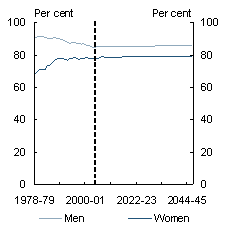
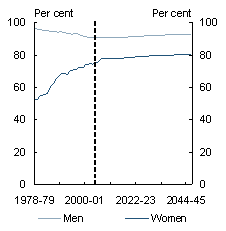
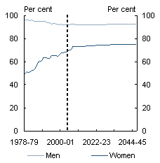
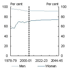
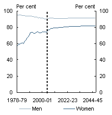
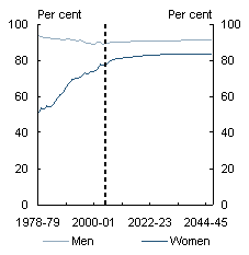
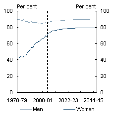
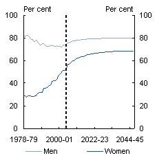
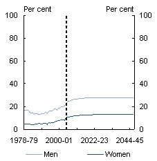
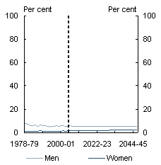
The age-specific participation rates for both men and women are projected to stabilise or increase in all age groups to 2046-47 (Chart 2.11). For most age groups (other than the very young) the total participation rate for men is higher than for women. This is projected to continue to 2046-47. The vast majority of prime-aged men — those aged 20-54 — are in the labour force. Prime-aged workers historically have had higher participation rates than those over55, although rates for older people have risen in recent years, a trend which is projected to continue.
Participation rates are projected to increase for women of all ages, particularly older women. The participation rates of older women have increased significantly over the past 20years. In recent times, this may be associated with the gradual increase in the Age Pension age for women (63 at present and reaching 65 by 2014).
It also is projected that by 2046-47 women participating in the workforce will be almost evenly distributed between full-time and part-time work.
Chart 2.11: Participation rates: history and projections
|
Age 15-19 |
Age 20-24 |
|
|
|
|
Age 25-29 |
Age 30-34 |
|
|
|
|
Age 35-39 |
Age 40-44 |
|
|
|
|
Age 45-49 |
Age 50-54 |
|
|
|
|
Age 55-59 |
Age 60-64 |
|
|
|
|
Age 65-69 |
Age 70 and over |
|
|
|
Source: Australian Bureau of Statistics data and Treasury projections.
|
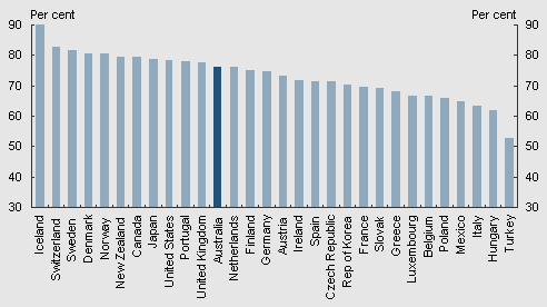
Box 2.2: Participation rates across the OECD Australia’s participation rate of 76.2 per cent for people aged 15-64 in 2006 is the twelfth highest in the OECD (Chart2.12). Chart 2.12: OECD participation rates 2006, people aged 15-64
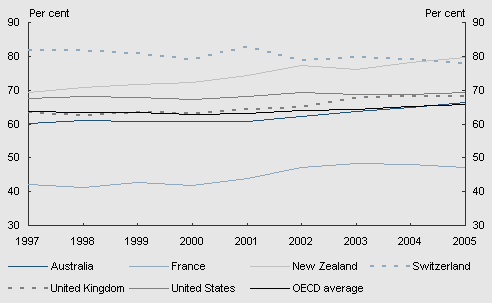
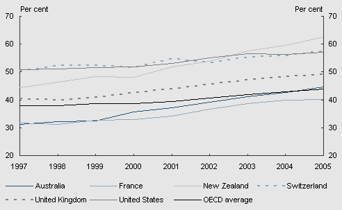
Source: OECD Employment Outlook 2006, Australian Bureau of Statistics data. The participation of mature-age people has been a major contributor to the high participation rates for these countries. Across the OECD, mature-age participation rates have been rising on average over recent years. For men, mature-age participation rates across the OECD have risen gradually, although outcomes differ widely across countries (Chart 2.13). Australia’s mature-age participation rates for men have risen faster than the OECD average. The rate for men aged 55-64 has risen from 60 per cent in 1997 to over 66 per cent in 2005, just higher than the OECD average in that year. Participation rates for women across the OECD in the same 55-64 age group have risen more strongly than those for men. Australia’s rise has been particularly strong — 14percentage points since 1997. This brings the Australian rate for women in this age group to just higher than the OECD average (Chart 2.14). Notwithstanding these significant rises, several countries continue to have much higher mature-age participation rates, including some with similar economic circumstances to Australia. The participation rate for men aged 55-64 in New Zealand rose to 80 per cent in 2005, 14 percentage points higher than Australia’s rate in that year. The rise for mature-age women in New Zealand has been even more striking, from 44percent in 1997 to 63 per cent in 2005, 18 percentage points higher than Australia’s rate in that year. Chart 2.13: Participation rates for men aged 55-64
Source: OECD Country Statistical Profiles 2006. Chart 2.14: Participation rates for women aged 55-64
Source: OECD Country Statistical Profiles 2006. |
Employment and unemployment
The proportion of people in the labour force who have jobs depends on the unemployment rate. Projections of the unemployment rate are based on the rate that can be sustained without generating upward pressure on inflation, often called the non-accelerating-inflation rate of unemployment (NAIRU).
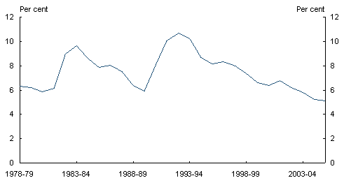
The NAIRU varies over time for a range of reasons, including changes in the structure of the labour market, the way inflation expectations are formed and demographics. Consequently, estimating the NAIRU is difficult. At the time of IGR1, the unemployment rate was around 6 per cent, and projected to fall to a NAIRU of 5 per cent by 2006-07. That projection has turned out to be close to the actual path of unemployment since then, with the unemployment rate falling to below 5 per cent in the middle of 2006 (Chart2.15). It is also consistent with recent estimates of the NAIRU.4 This report assumes the same level for the NAIRU as in IGR1.
Chart 2.15: Unemployment rate
Source: Australian Bureau of Statistics data.
Hours worked
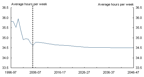
The average number of hours worked per week per worker has fallen from 35.8in 1996-97 to 34.6in 2005-06. Beyond the forward estimates, there is a gradual decline in average hours worked to 34.5 by 2046-47 (Chart 2.16). The fall in average hours worked is mainly due to the rising proportions of older workers and women working, with both of these groups more likely to work part time.
Chart 2.16: Average hours worked per worker
Source: Australian Bureau of Statistics data and Treasury projections.
Productivity
Labour productivity is a measure of the quantity of goods and services produced per hour of work. As labour productivity grows, higher levels of output are produced with given labour inputs. Growth in labour productivity will be the key determinant of real GDP growth in the decades ahead. Faster labour productivity growth would enable higher growth for real GDP, real GDP per person and real wages over the projection period.
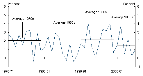
Annual labour productivity growth has averaged 1.8 per cent over the past 40years but has varied considerably from decade to decade (Chart 2.17). It was above its long-term average in the 1970s (2.0 per cent), slowed in the 1980s (1.2 per cent), but picked up again in the 1990s (2.1 per cent), accelerating noticeably from the middle of the decade. From 2000, however, annual labour productivity growth has slowed to arou
nd 1.5percent.
In principle, labour productivity growth is influenced by many developments in the economy, including changes in capital intensity, and in the composition of the workforce, brought about by changes in age-specific participation rates or the age distribution of the population. In practice, labour productivity growth is difficult to forecast over long horizons. Because of this, productivity in IGR1 was projected to grow at its average rate over the previous 30 years, which at the time was 1 per cent. While productivity grew faster in the second half of the 1990s, productivity growth since 2000 has been slower. The experience since IGR1 suggests that the assumption adopted there was reasonable. Using the same methodology as in IGR1, annual productivity growth beyond the forward estimates period is assumed to be 1 per cent, which is again its average rate over the past 30 years.
Chart 2.17: Labour productivity growth
(real GDP per hour worked)
Note: Data prior to 1978-79 are Treasury estimates. Data are annual averages.
Source: Australian Bureau of Statistics Cat. No. 5206.0.
Economic growth projections
Labour productivity is projected to grow over the next 40 years at around the same rate as in recent decades, but the growth rate of real GDP per person is projected to slow because of the ageing of the population. The growth rates of population, employment and real GDP are projected to slow significantly (Table 2.3). A substantial fall in the proportion of the population of traditional working age is projected with the retirement of the baby boomer generation (born between 1946 and 1964), particularly in the 2020s (Chart 2.5 and Table 2.2). As a result, the rate of growth of real GDP per person in that decade is projected to be particularly low, before picking up slightly in subsequent decades.
Table 2.3: Growth in economic aggregates(a)

- Average annual growth rates (percent).
Source: Australian Bureau of Statistics data and Treasury projections.
Real GDP per person
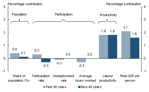
Growth in real GDP per person can be decomposed into contributions from the 3Ps of population, participation and productivity (Chart 2.18).5
Chart 2.18: The 3Ps of growth in real GDP per person
Source: Australian Bureau of Statistics data and Treasury projections.
Over the past 40 years, the proportion of the population aged 15 and over has increased substantially as fertility rates have fallen and life expectancy has risen. Overall, this component has added an average of 0.4 of a percentage point to annual growth in real GDP per person. Over the next 40 years, this component’s contribution is projected to be smaller (about 0.1 of a percentage point): life expectancy will continue to rise but the dramatic fall in the fertility rate of the 1970s is not expected to be repeated.
The participation component represents the number of hours worked per adult. This depends on the participation rate, the proportion of the labour force with jobs and average hours per worker.
Despite ageing of the population, the participation rate has increased substantially over the past 40 years with the relatively large baby boomer generation reaching working age and women becoming increasingly active in the labour force. On the other hand, the current unemployment rate of below 5 per cent, while the lowest in the past 30 years, is higher than in the 1960s, when it was around 2 per cent. In addition, average hours have fallen because of the increasing prevalence of part-time work. While some of these changes are quite large in absolute terms, the annual impacts averaged over 40 years are relatively small. Overall, participation has subtracted around 0.1 of a percentage point from annual growth in real GDP per person over the past 40 years.
Over the next 40 years, projected changes in the unemployment rate and average hours worked are only small. The participation rate is projected to fall (after an initial rise) as the large baby boomer generation moves from the labour force into retirement. This will be accentuated by further increases in life expectancy. Offsetting this to some extent is an increase in participation rates among older workers and a higher number of migrants, who are disproportionately young adults with high participation rates (Chart 2.3). Because of these mitigating factors, the expected adverse impact of the participation rate (and the participation component overall) on real GDP per person is projected to be smaller than was anticipated in IGR1. Nevertheless, participation is expected to subtract 0.3 of a percentage point from annual growth in real GDP per person over the next 40years.
Labour productivity has contributed most to growth in real GDP per person over the past 40years: 1.8 of a total of 2.1 percentage points. Because population and participation are projected to have a small negative impact, real GDP per person is projected to grow a little less quickly than labour productivity, at around 1.6 per cent per year. This is around 0.5 percentage points less than over the past 40 years.
Real GDP
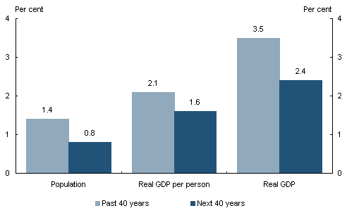
Real GDP is the product of the total population and real GDP per person. Over the past 40years, the population grew at an average annual rate of 1.4 per cent. When added to growth of real GDP per person of 2.1 per cent, this gave annual average real GDP growth of 3.5percent (Chart 2.19). Annual population growth is projected to slow to around 0.8percent over the next 40 years. This is largely due to the falls in fertility rates starting in the 1970s — the effects of fertility on population are manifest for a long time — which are only partly offset by increases in life expectancy. As a consequence, annual average real GDP growth is projected to slow to 2.4 per cent.
Chart 2.19: Real GDP and real GDP per person
(average annual growth)
Source: Australian Bureau of Statistics data and Treasury projections.
|
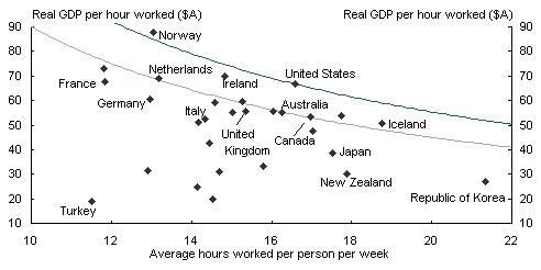
Box 2.3: International comparisons OECD country data on labour productivity (GDP perhour worked) and participation (average hours worked per person) in 2005 show a wide range of outcomes (Chart 2.20). For each country, GDP per hour is expressed in Australian dollars at purchasing power parity. The lower line in the chart shows combinations of GDP per hour and hours per person that generate the same GDP per person as in Australia in 2005. For example, the Netherlands has higher productivity and lower average hours but the same GDP per person. Countries above the lower line have higher GDP per person than Australia. The United States has slightly higher average hours and substantially higher productivity. Norway also has high GDP per person despite significantly fewer hours worked, although this is largely the consequence of oil production. Chart 2.20: Productivity and participation in OECD countries in 2005
Note: Average hours worked per person are calculated across the whole population, not just those in the labour force. Thus, the horizontal axis combines the population and participation components of the 3Ps. Source: OECD Productivity Database, September 2006. In all OECD countries, earlier falls in fertility rates and rising life expectancies are expected to lead to declines in the share of the population of traditional working age and the rate of growth of real GDP in the future (Table 2.4). Australia’s average real GDP growth rate is projected to be stronger in the first half of the 2010s (reflecting projected stronger employment growth) than for the United States, the United Kingdom, New Zealand and Japan. Table 2.4: International projections
Note: Numbers are annual averages (per cent). Source: Treasury projections; Congressional Budget Office (USCongress),2007; Her Majesty’s Treasury,2006; The Treasury (New Zealand),2006; and Japan Center for Economic Research, 2006. |
Nominal GDP, prices and wages
Real GDP measures the level of real economic activity in the economy. However, nominal GDP is used to compare the dollar-value of spending projections relative to the size of the economy. To convert from real to nominal GDP, an estimate of the GDP deflator is required.
Over the projection period beyond the forward estimates, the GDP deflator and the CPI are assumed to grow together. Both measures therefore are assumed to exhibit annual growth of 2 per cent, consistent with Australia’s medium-term inflation target.
Real wages are assumed to grow in line with labour productivity, consistent with unemployment at the NAIRU and a steady inflation rate over the projection period. Nominal wage growth is equal to real wage growth plus growth in prices (either consumer prices or the GDP deflator, since they are projected to grow at the same rate). With real wages and productivity growing at the assumed annual rate of 1 per cent, nominal wages therefore are projected to grow at 4 per cent (that is, at a rate reflecting inflation of 2percent and real wage growth of 1 per cent).
Comparison with IGR1: GDP and population
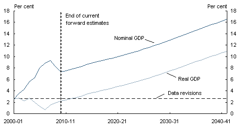
Differences between the assumptions described in previous sections for IGR2 and those for IGR1 produce significant changes in projected outcomes. Nominal GDP is projected to be more than 16 per cent higher by 2041-42 than was projected in IGR1 and real GDP around 11 per cent higher (Chart 2.21).
Chart 2.21: Nominal and real GDP: Percentage change from IGR1 to IGR2
Source: Australian Bureau of Statistics data and Treasury projections.
Differences out to the end of the current forward estimates period in 2009-10 are due to data revisions since IGR1, which have raised the estimated levels of real and nominal GDP in 2000-01, as well as the terms of trade improvement and movements in productivity and participation rates, which are discussed in more detail in the later section on GDP per person.6
Population
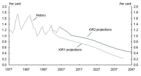
Differences in population growth rates are the largest single source of the differences in nominal and real GDP between IGR1 and IGR2 over the next several decades. In IGR1, Australia’s population was projected to grow to 25.3 million by June 2042, but in IGR2, this population projection is 27.8 million, around 10per cent higher. Annual population growth has been greater than 1 per cent in all but one of the past 30 years. In IGR1, annual population growth was projected to fall steadily, to under of a per cent by 2042. In IGR2, population growth still falls over time, but much less dramatically (Chart 2.22).
Chart 2.22: Annual population growth rates
Source: Australian Bureau of Statistics data and Treasury projections.
A small part of the difference in projected population levels — a little less than 1percentage point — is due to revisions to population estimates and faster population growth between 2001 and 2006 than was projected in IGR1. Most of the difference, however, reflects increased fertility rates, increased migration and declines in mortality, which are anticipated to continue over the projection period (Chart 2.23).
Chart 2.23: Population projections: Percentage change from IGR1 to IGR2
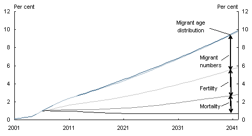
Note: The chart shows the contributions of changes in assumptions about, in turn, mortality, fertility, migrant numbers and migrant age distribution for 2007 to 2042. The impacts shown are cumulative and depend somewhat on the order in which the changes are imposed.
The residual difference represents data revisions and differences between projections in IGR1 and actual outcomes between 2001 and 2006, and interactions between these differences and assumptions for 2007 to 2042.
Source: Australian Bureau of Statistics data and Treasury projections.
Mortality rates have been falling faster than was anticipated in IGR1, so life expectancy at birth is now projected to be higher, especially for men. This change is projected to add around 2 percent to population by 2042. Fertility rates have been higher over the past five years than expected in IGR1, and projected fertility rates have been raised to reflect this. This revision adds 3percent to population by 2042.
Net overseas migration is projected to be 110,000 people per year from the end of the forward estimates period, compared with 90,000 under IGR1. Moreover, migrants are now projected to be slightly younger on average and thus more likely to live for longer after their arrival in Australia. Overall, changes in migration patterns are projected to add around 4percent to the population by 2042, with almost all of this from increased migrant numbers.
Comparison with IGR1: GDP per person
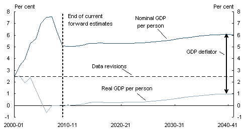
Developments in government spending and revenue are usefully examined on a perperson basis, and it is likewise insightful to examine developments in nominal and real GDP per person. Projections of both nominal and real GDP per person over the next 40years are higher in IGR2 than they were in IGR1 (Chart 2.24).
Data revisions since IGR1 which raised the estimated levels of nominal and real GDP in 2000-01 (and beyond) also raised the levels of nominal and real GDP per person (since revisions to population estimates were much smaller).
Aside from data revisions, the higher projected level of nominal GDP per person over the next several decades largely reflects higher outcomes between 2001-02 and 2006-07, with the biggest contribution arising from the recent strong rise in the terms of trade (as detailed below).
The higher level of real GDP per person in 2000-01 resulting from data revisions has been
offset by slower subsequent growth than projected in IGR1, so that real GDPperperson in 2006-07 is forecast to be a little lower than the level projected in IGR1. For the years beyond 2006-07, real GDP per person is projected to grow only slightly faster than in IGR1 (Chart2.24).
Chart 2.24: Nominal and real GDP per person:
Percentage change from IGR1 to IGR2
Source: Australian Bureau of Statistics data and Treasury projections.
GDP deflator
Price impacts on government expenditure depend mainly on consumer prices and nominal wages. Nominal GDP and nominal GDP per person, however, depend on a broader set of prices, including prices of consumption goods, investment goods, dwelling construction and exports.
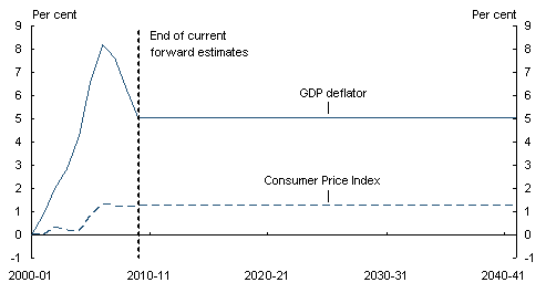
By 2006-07 the GDP deflator (which measures the average level of prices of the various components of GDP) is forecast to have risen by around 8percent more than was projected in IGR1. This is predominantly due to the recent boom in the terms of trade and, to a lesser extent, the earlier housing boom. The impact of the terms of trade and housing booms on the level of the CPI, however, has been much more muted (Chart2.25).
While it is difficult to forecast the future path of the terms of trade, the forward estimates assume that some of the past increases will be reversed, so that the level of the GDP deflator is projected to be around 5 per cent higher by 2009-10 than in IGR1. Since its rate of growth beyond 2010-11 is assumed to be the same as in IGR1 (2percent per year), the 5 per cent level gap is projected to be maintained out to 2041-42.
Chart 2.25: The GDP deflator and the CPI:
Percentage change from IGR1 to IGR2
Source: Australian Bureau of Statistics data and Treasury projections.
Real GDP per person
The level of real GDP per person is projected to be around 1per centhigher by 2041-42 than in IGR1. This is somewhat less than the impact of data revisions since the release of IGR1, which have added around 2 percent to real GDP per person.
Real GDP per person depends on productivity (output per hour worked) and hours worked perperson. Growth in real GDP per person has been slower than was anticipated in IGR1 and this is forecast to have offset the impact of data revisions by 2006-07. This slower growth has been due almost entirely to productivity growth over the past few years being slower than assumed in IGR1. Projected productivity growth in the future in IGR2 is 1 per cent per annum, unchanged from the IGR1 assumption. By 2041-42 faster growth in hours worked per person is projected to lift real GDP per person by about 1per cent relative to the outcomes projected in IGR1.
As explained above, changes in hours worked per person are driven by changes in age- and gender-specific participation rates and average hours, and by the impact of demographic changes on the age and gender composition of the population. These factors interact, making it difficult separately to identify their contributions to changes in hours worked perperson. Nevertheless, in broad terms, changes in assumptions about participation rates and average hours worked between IGR1 and IGR2 contribute around 1percent to hours worked per person from 2006-07 to 2041-42 and demographic changes subtract around per cent. As a result, hours worked per person are projected to rise by about 1percent relative to IGR1 over this period.
Trends in participation rates for older workers now are projected to be considerably more favourable than they were in IGR1.7 This becomes increasingly important in later years with the rising proportion of older workers in the population.
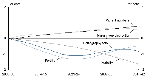
The overall impact of changes in demographic assumptions is small, but individual factors have larger, though offsetting, effects (Chart 2.26). All demographic factors increase population growth relative to IGR1, but they increase real GDP per person only if they have a larger proportional impact on the growth of the traditional working-age population than on the number of children and older people.
Chart 2.26: Demographic contributions to real GDP per person:
Percentage change from IGR1 to IGR2
Note: The impacts shown depend somewhat on the order in which the changes are imposed and are affected by interactions with differences between projections in IGR1 and actual outcomes between 2000-01 and 2005-06. Changes in assumptions from IGR1 to IGR2 are imposed in the order: mortality, fertility, migrant numbers and migrant age distribution.
Source: Australian Bureau of Statistics data and Treasury projections.
Changes in assumptions about mortality and fertility have lowered real GDP per person relative to projections in IGR1. Decreases in mortality rates mainly raise the number of people living beyond normal retirement age, and so reduce real GDP per person. Higher fertility does not have an impact on real GDP until children enter the labour force, usually in their late teens or their twenties. Thus, as a result of higher fertility, real GDP per person falls at first, but starts to recover after around 20 years. The positive effects of higher fertility on real GDP per person are not felt until beyond the end of the IGR2 projection period.
The changes in migration assumptions add to real GDP per person. Because the proportion of migrants of prime working age is higher than for the resident population (Chart2.3), an increase in migrant numbers leads to a rise in real GDP per person. The change in projected migrant numbers between IGR1 and IGR2 — 20,000 per year — leads to a modest rise in real GDP per person. The move to a greater emphasis on young skilled migrants also is projected to have a modest positive impact on real GDP per person, since such migrants disproportionately belong to age groups with higher participation rates and have a tendency to remain in the labour force for longer.
Productivity and labour utilisation
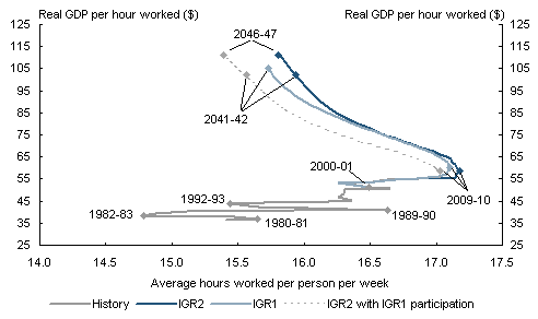
Chart 2.27 shows the effects of population, participation and productivity on real GDP per hour worked and hours worked per person in recent history and their projected effects under IGR1 and IGR2. Vertical movements in the chart show changes in GDP per hour worked, or labour productivity. Horizontal movements show changes in average weekly hours worked perperson. They represent changes in both population and participation.8 The lines on the chart trace out combinations of real GDP per hour and hours worked per person in successive years.
Chart 2.27: Productivity and labour utilisation
Note: Average hours worked per person are calculated across the whole population, not just those in the labour force. Real GDP per hour worked is in 2006-07 dollars.
The IGR2 with IGR1 participation line shows IGR2 projections assuming participation rates and average hours worked by age and gender at the levels projected in IGR1.
Source: Australian Bureau of Statistics data and Treasury projections.
Up to 2000-01, there was a general north-eastward movement of the line, reflecting increases in the proportion of the population of working age, and in participation and productivity. The substantial side-to-side swings correspond to recessions and subsequent recoveries. In IGR1, hours worked perperson were projected to rise to a gentle peak towards the end of the current decade and then, once the baby-boomer generation began to retire, to fall steadily. By 2041-42, the end of the projection period in IGR1, hours worked per person were projected to have fallen to a level last seen around 1993-94, soon after the early 1990s recession, when labour utilisation remained at a relatively low ebb.
In the new projections, hours worked per person are again projected to rise to a gentle peak at the end of the current decade. The peak is somewhat higher and the subsequent fall more gradual than in IGR1, with the improvement due principally to higher projected participation rates for older workers and higher levels of skilled migration. Improvements since IGR1 in participation rates and average hours worked by age and gender have moved the line in Chart 2.27 to the right from the ‘IGR2 with IGR1 participation’ line to the IGR2 line.
1 United Nations, World Population Prospects: The 2006 Revision Population Database.
2 To be precise, both the 85per cent and the chart refer to the age distribution of the net inflow of migrants to Australia. This net inflow is the number of permanent and long-term arrivals to Australia minus the number of permanent and long-term departures from Australia. The chart also shows the age distribution of the net inflow of migrants used in projections in IGR1. This IGR1 distribution is discussed later.
3 The number of births is affected by the number of women of child bearing age, along with the TFR; whereas the number of deaths is mainly driven by the number of people aged over 65 and their longevity. Over time, the ageing population will result in both a decrease in the proportion of women of child bearing age and an increase in the proportion of aged people. In the current Treasury projections, population ageing is expected to lead to a slow decline in the level of natural increase from 2020. However, it is not until the 2050s that net natural increase is projected to be negative.
4 For example, using the latest available data, and following the methodology of Gruen, Pagan and Thompson,1999, which allows for a time-varying NAIRU, gives an estimated NAIRU of around 5percent in the September quarter of 2006, while Treasury’s TRYM model of the Australian economy gives an estimate of 4percent.
5 Real GDP per person can be written as ![]() where α is the proportion of the population aged15and over, ρ the participation rate, u the unemployment rate, h average hours worked, and π is real GDP perhour worked. Therefore, in a 3Ps decomposition of real GDP per person, α is population,
where α is the proportion of the population aged15and over, ρ the participation rate, u the unemployment rate, h average hours worked, and π is real GDP perhour worked. Therefore, in a 3Ps decomposition of real GDP per person, α is population, ![]() is participation, and π is productivity. See also Henry (2002, 2003).
is participation, and π is productivity. See also Henry (2002, 2003).
6 Historical levels of nominal and real GDP were revised up by around 3percent as a result of updating of the national accounts annual benchmarks in 2005. This was partly offset by other, downward, revisions of around of a per cent made to the estimates of 2000-01 nominal and real GDP in the intervening years. See 2004-05 Australian System of National Accounts, Australian Bureau of Statistics Cat. No.5204.0.
7 See Kennedy and Da Costa, 2006.
8 Population ageing leads to generally offsetting effects on the proportion of the population of working age (which tends to rise as the proportion of those under 15 falls) and on the participation rate and average hours worked (which tend to fall). The measure ‘hours worked per person’ captures these generally offsetting effects.
